Emmet Re:view: Test Your Responsive Design in Multiple Viewports
Emmet Re:View is a Chrome add-on developed by emmet.io that provides a fast and easy way to test the responsiveness of your web page. With this tool, you can view your web page in multiple viewports side-by-side, allowing you to quickly see how it looks at different resolutions and on different devices.
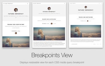
One of the standout features of Emmet Re:View is the Breakpoints View. This feature displays a resizeable view for each CSS media query breakpoint of your page. It also automatically downscales the contents of large viewports to fit your screen size, giving you an accurate representation of how your page will look on different devices.
Another useful feature is the Device Wall, which provides a bird's-eye overview of device-sized viewports. In this mode, each view is scaled according to the `` tag of your page and overrides the User-Agent with real device values. This allows you to see exactly how your page will appear on different devices.
Emmet Re:View also allows you to create your own devices and presets for the Device Wall, giving you even more flexibility in testing your responsive design.
One of the standout aspects of Emmet Re:View is its PageSync engine, which synchronizes all user interactions across all viewports. This means that not only can you scroll, fill in form fields, and click on elements in one view, but you will also see instant feedback in all the other views. This makes it incredibly easy to test and fine-tune your responsive design.
Overall, Emmet Re:View is a valuable tool for web developers and designers who need to ensure that their websites are responsive and look great on different devices. With its intuitive interface and powerful features, it simplifies the process of testing and optimizing responsive designs.